We have renewed our corporate identity so that it is a much better representation of the major change we are undergoing. New challenges, new hopes, and a long road ahead of us. Discover the new Papresa.

In late 2020, the industrial group Quantum Capital Partners took over Papresa to develop all its potential in the paper industry. This transformation process is to be implemented through an ambitious investment plan to modernise the plant and adapt to new market trends, maintaining and improving its sustainability.
Over the years, Papresa has proven its capacity to adapt and to carry on even at times of crisis, and this new stage marks a future full of success. A change of image was therefore required that reflected the transformation and symbolised its values and everything it will achieve.
The agency Colillas Branding, was responsible for this change in corporate image, and was able to conceptualise the process, which does not break with the past but uses all its baggage to build a better future.
The old logo
The Papresa elephant is iconic. It has represented the brand for many years, and should continue to do so because the meanings associated to this animal remain the values of Papresa.

Why does the elephant continue to represent Papresa?
The elephant is the largest mammal in the world and, despite its size and weight, can travel at great speeds over long distances. They are long-lasting animals that are extremely intelligent and socially complex, and their herd includes not only relatives like other mammals but also close friends and even strangers.
Descendants of the mammoth, they have adapted physically over the generations to avoid extinction. In fact, it has been seen over recent years that a large percentage of African females no longer grow tusks. The scientific community is certain that this is an evolutionary response by the species to survive hunters.
As can be seen, the elephant represents a large part of the values and history of Papresa. Adaptation, relationship with the environment, and strength.
Why was a change in logo needed?
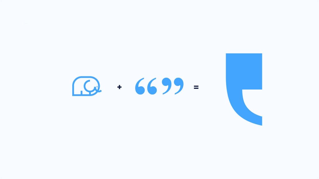
Despite the fact that the elephant was a valid icon, restyling was required to reflect our new beginnings and change. The team responsible for the corporate brand has encapsulated the drawing of the elephant and condensed it down into a figure full of meaning: the typographer’s quotes in clear homage to the relationship between Papresa and newsprint.
This paid homage to the past yet showed the decisive will of the company to evolve.
The blue colour has also be kept due to the fact that it is closely identified with Papresa within the industry, although two corporate blues have been chosen for a more balanced and lively development of the identity.
The result of this entire project is a corporate identity that is a much better representation of the present and future of Papresa, which we hope you share with us.
